End-to-End UX Evaluation and MVP Redesign for Fundraising Presentation
Summary
When I joined Finalis, the platform had grown on top of legacy systems, resulting in complex navigation, generic workflows, scattered data, and limited visibility for both customers and internal teams.
Our team was responsible for improving and later replatforming the compliance experience used by bankers and back-office analysts. Through a mix of UX redesign and operational alignment, we turned a confusing, multi-layered process into a clearer, simpler, and more predictable experience.
Incremental improvements during 2023 raised annual CSAT from 72% to 86%, and in 2024, the launch of the simplified homepage further increased satisfaction to 93% while reducing support requests related to submission status.
Explore an AI-enabled prototype created for early internal validation with the Delivery team, highlighting the latest iterations of the Back-office Tracker and Case Details redesign in 2025.


Problem Framing
Patras had grown rapidly, adding features without a cohesive UX strategy. As a result, the product felt fragmented: each section had its own navigation patterns, visual language, and interaction logic. Users struggled to understand the purpose of each area, how features connected, or how to take meaningful action. The interface lacked consistency, guidance, and contextual cues, making the experience feel confusing and unintuitive.
Our challenge was to bring clarity, structure, and coherence to the product so users could understand the value of their analytics and manage their time effectively.
The Process
Our Approach
We partnered closely with the PM and CTO to evaluate the product, align on priorities, and define how to proceed:
The heuristic evaluation and prioritization
Conducting user interviews
Establishing consistent navigation and UX patterns
Defining the visual direction and design foundations
High fidelity prototyping of the entire platform (B2C & B2B)
UX Evaluation
We began with a full heuristic evaluation to understand why the experience felt fragmented. We identified visual inconsistencies, navigation patterns that changed across screens, unclear hierarchy, and sections that lacked a shared purpose.
Much of the product had been developed in isolated iterations, resulting in an interface where every screen felt like a different product. We documented all issues, prioritized them, and delivered a structured report that aligned the CTO and engineering team on next steps.
User Insights
Through user interviews, we explored how people interpreted the product structure, whether they understood each section's purpose, and how Patras fit into their daily routines.
These insights revealed confusion around information architecture, limited contextual guidance, and opportunities to improve clarity and productivity. The findings directly informed our design decisions and validated where simplification was needed.
Design Foundations & Systematization
Based on the evaluation, we created a unified design layer to bring coherence back to the product. This included defining visual foundations (typography, color, spacing, iconography) and establishing consistent interaction patterns for navigation, states, and system feedback.
We also built a first version of the component library, giving the team a scalable framework and reducing variability across the interface.
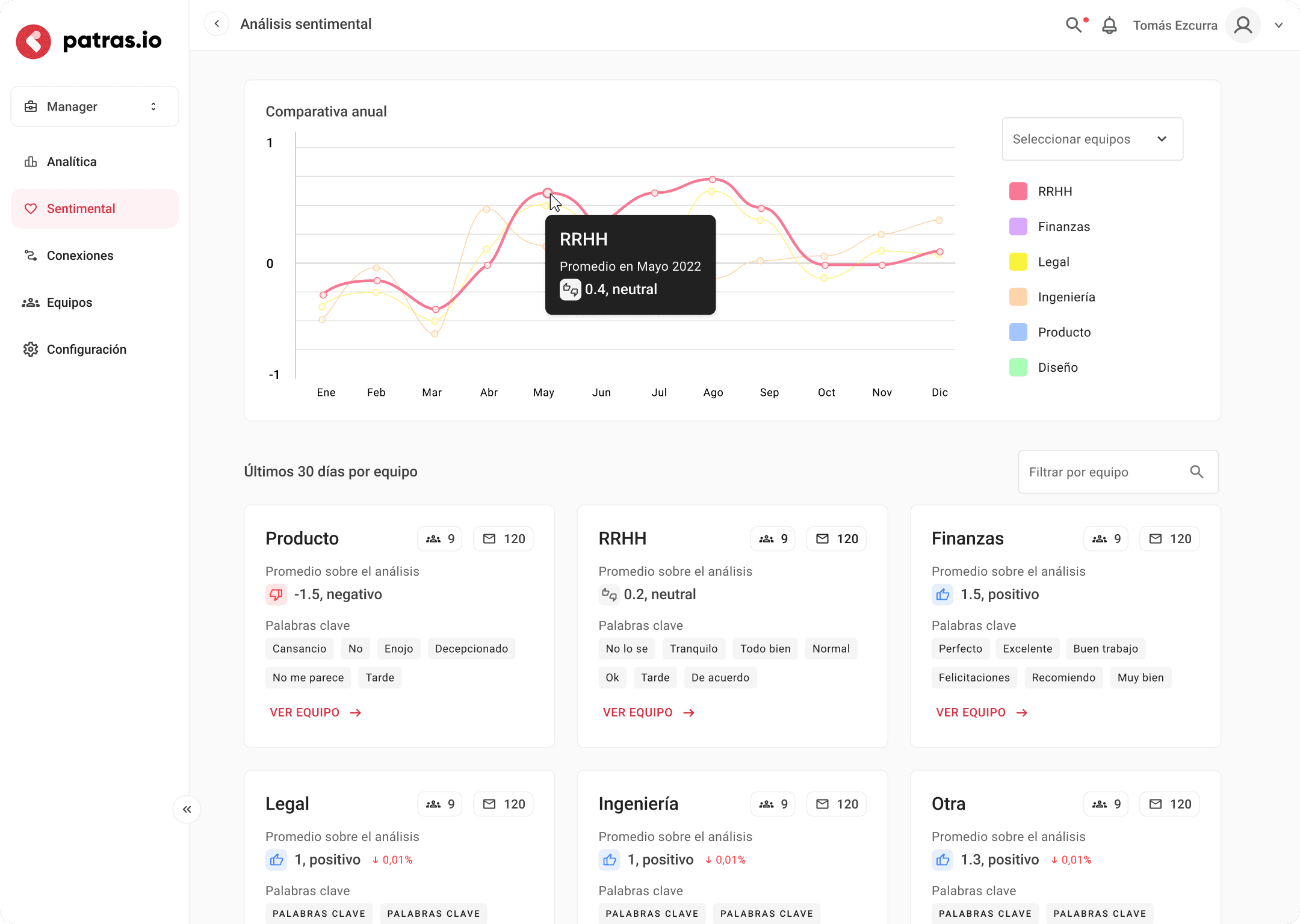
Strategic Expansion (B2B Exploration)
With the foundations in place, we explored how Patras could evolve into a B2B offering. Leveraging existing user insights, we designed an early concept for a manager dashboard—team analytics, interpretable metrics, and actionable recommendations.
This rapid exploration helped validate direction with stakeholders and supported the company’s fundraising efforts.
The Outcome
Our redesign brought consistency, clarity, and a stronger sense of purpose across Patras. Beyond improving navigation and core workflows, the updated experience delivered Patras’s real value: smart analytics layered on top of the user’s Google Calendar, plus personalized suggestions to help people plan time more intentionally. This new foundation also enabled us to move faster in development and explore the first B2B version of the product.
Key outcomes included:
A unified UX across Home, Calendar, Tasks, Settings, Notifications, and onboarding
Analytics-first Home view and clearer task categorization for better time distribution
A simpler “Share Calendar to book a meeting” flow for external users
A defined design system that accelerated development and ensured consistency
Early prototypes for the B2B version: team analytics, sentiment insights, and connection mapping